Etherfuse Branding
For Etherfuse Branding

Bachoo
Web and mobile solutions that boost your business
- Industry
Information Technology  Time & Budget
$25,000 to $50,000
About Etherfuse Branding
The Future of Prosperity
If you’ve read a news publication in the past 10 years, you’ve heard of blockchain. If the term is new to you, go read about it––we’ll wait.
Back with us? Great. Meet Etherfuse – a blockchain platform originating from Mexico that aims to expand decentralization in areas where blockchain adoption isn’t yet widespread. The main idea is to promote adoption by highlighting the benefits that blockchain can have in each respective area.
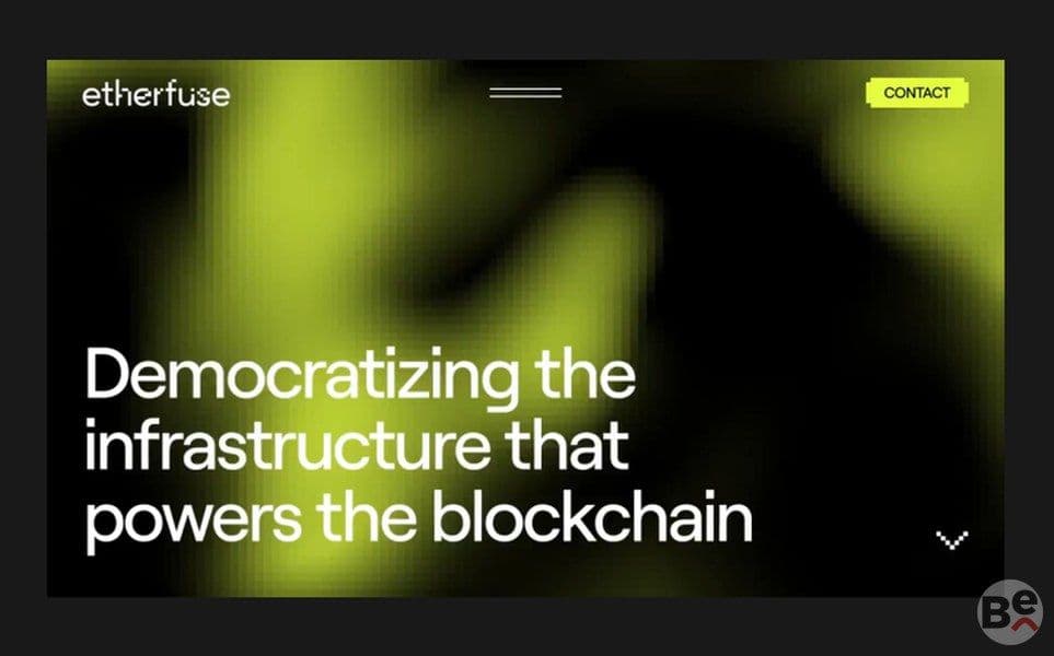
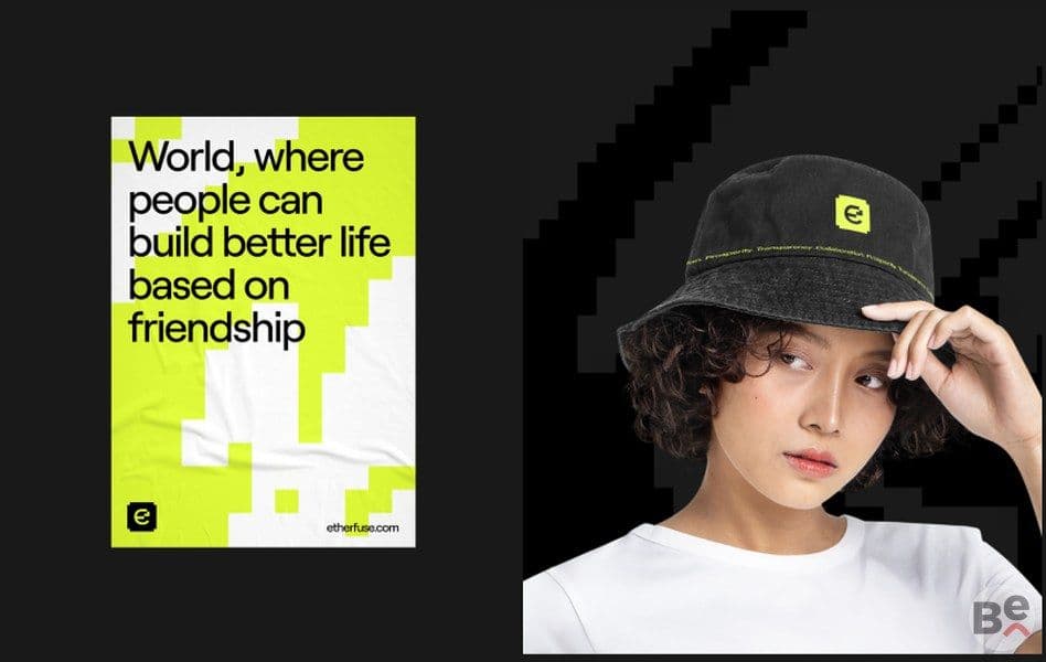
Blockchain is all the rage right now, and we’ve decided to skip following the “accepted norm” design – a clean, corporate-looking website with pastel colors. Instead, we’ve reached down into the depths of our childhood and went for a “The Matrix” inspired design, fusing what was considered cutting edge 20 years ago with what’s cutting edge today.
Strategy
During the discovery process, we’ve realized that we need to steer clear of things considered too technical or “nerdy” since, geographically, the target audience did not relate to these aspects much–in some cases even being apprehensive.
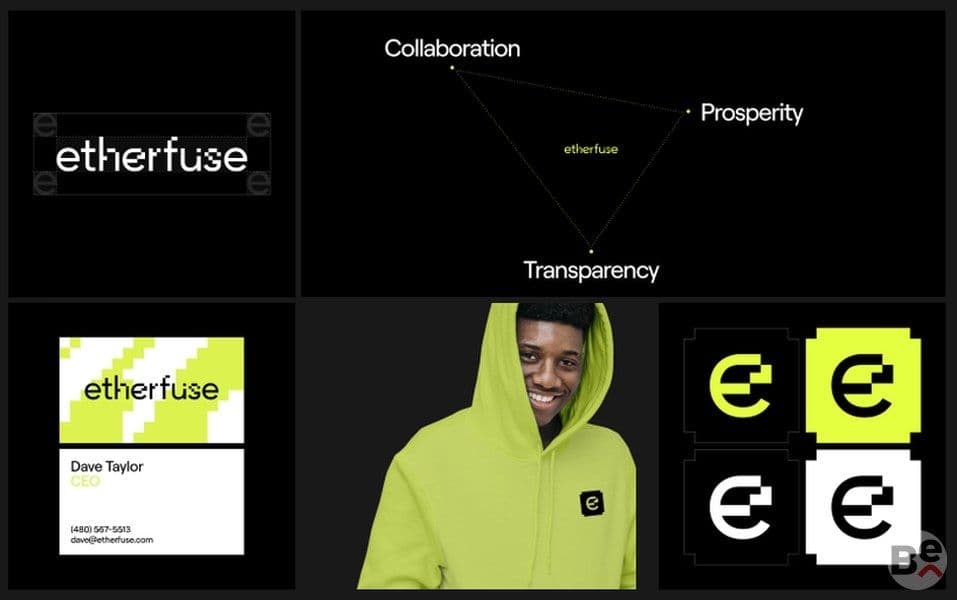
This paved the way for an approach that focused on highlighting values, whether they’re personal or collective, to highlight how blockchain can bring transparency to and cut out middlemen in everyday interactions.
Since the focus here was mostly on South America and Africa, the approach required a different kind of persuasion that involved focusing on how blockchain’s adoption can make improvements in social aspects, almost completely ignoring crypto talk. Family values, communication, and trust were among our central focus points.
Design Solution
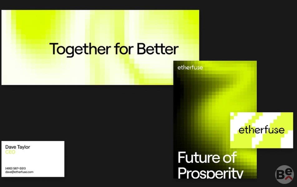
The universal word “Pixels”. Looking very digital and technological, just about everyone is familiar with the word pixel and what it stands for. If you don’t, Wikipedia has a great article about it. We’ll wait.
Now that we’re on the same page, the great thing about pixels is that they create something whole once you zoom out enough, and that’s a great analogy for the brand’s message – together for better, prosperity through collaboration.
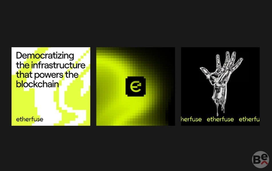
Using pixels, we’ve drawn a whole picture (and unified, too) – starting with the logo and concluding with patterns and abstract art. This approach allowed us to create a website that feels light, requires few resources to run and is pleasant to look at. It’s not very sci-fi either to ensure it’s audience-appropriate.